


Before you build a new website, you need to build a great brand.
Before you build a new website, you need to build a great brand.
Background
Elmira came to Plinth after seeing the work we did for Cassava. Owner and partner Jen Bell approached us about re-vamping Elmira’s website. After taking a look at their old website, we advised Elmira that their brand didn’t reflect the true nature of their business. We cautioned them that building a website without re-branding would further communicate the wrong brand elements.
Plinth was challenged with communicating the essence of Elmira by creating a new logo, website, and brand experience.

Awakening the essence of Elmira.
Awakening the essence of Elmira.
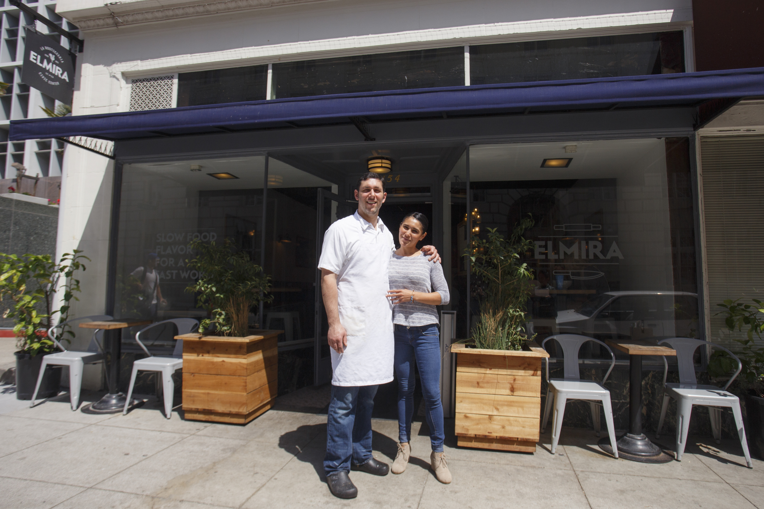
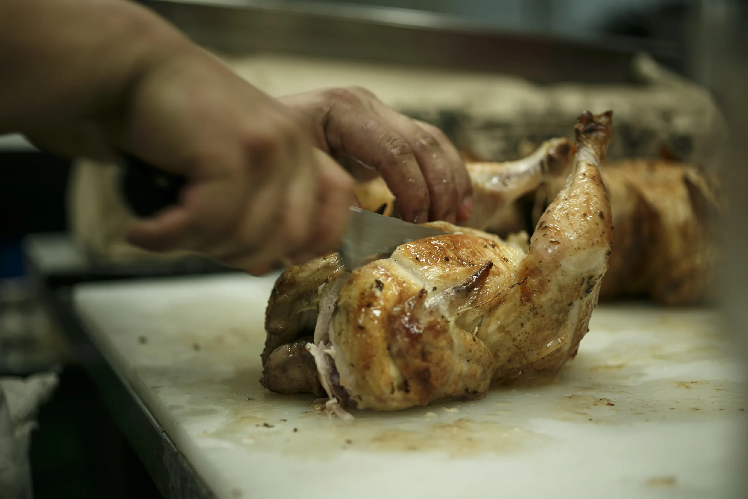
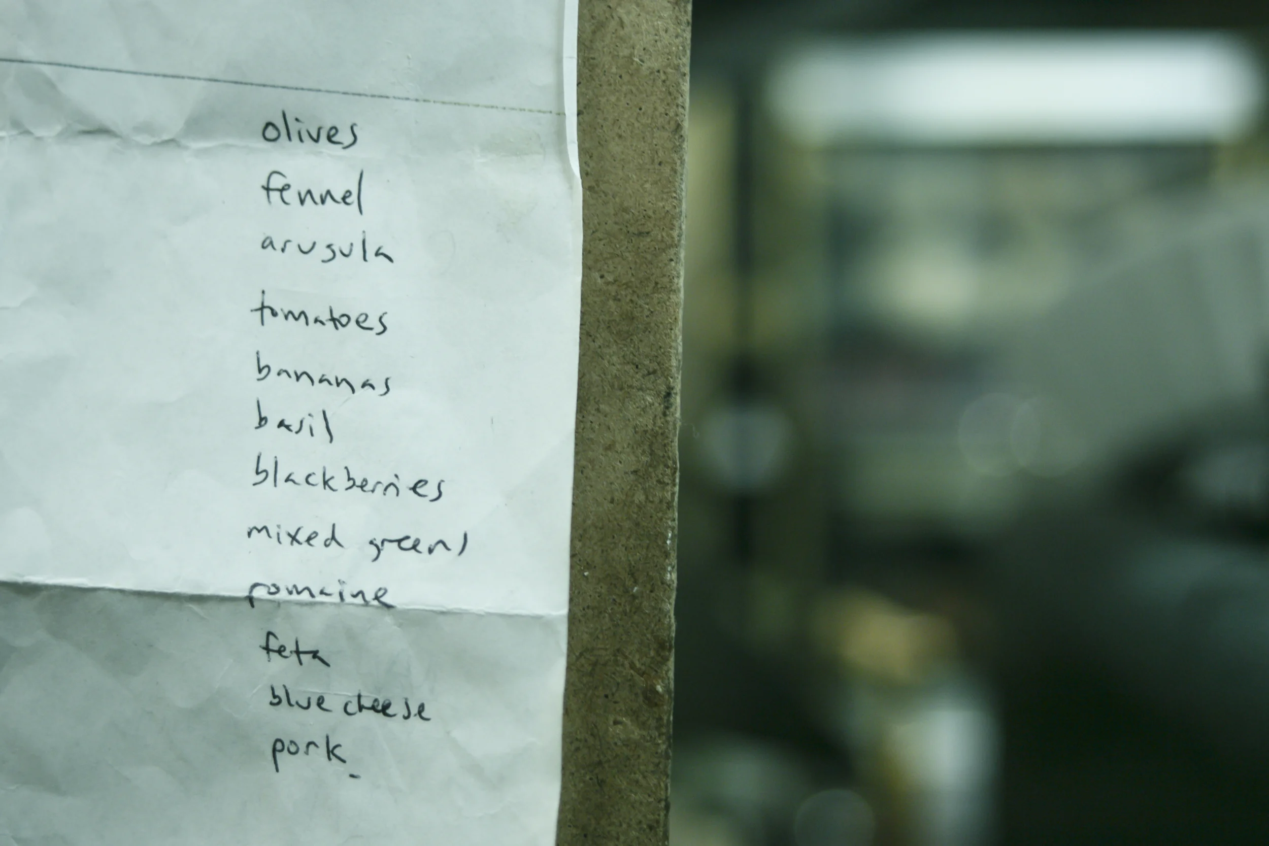
After speaking with owners Chef Mark Passetti and Jen Bell, we learned that Elmira is an eatery focusing on farm fresh ingredients, house made pastries, rotisserie, whole animal butchery and classic Italian recipes handed down through THE generations.
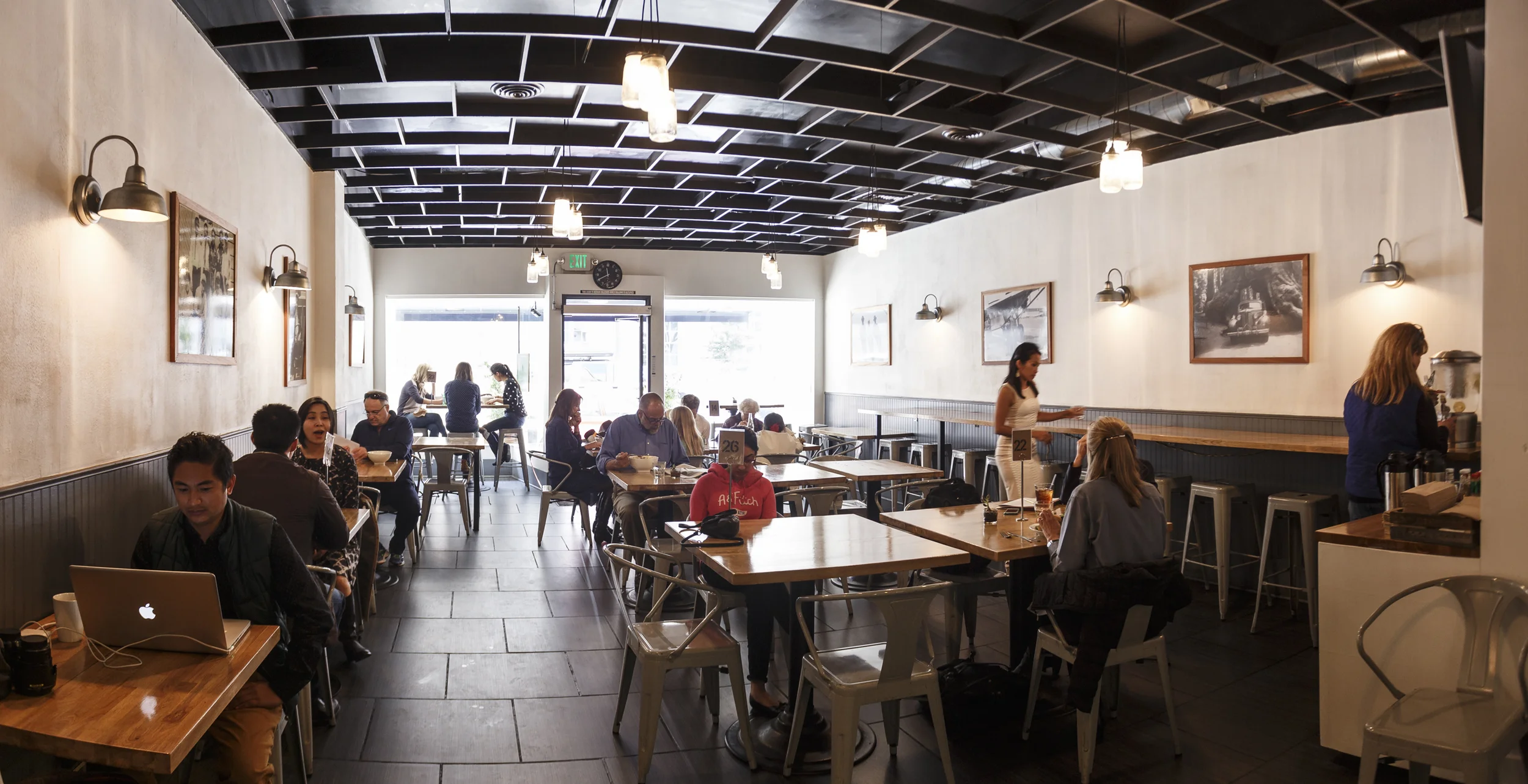
Elmira pays homage to their roots by displaying original Passetti family photos along the walls.

SLOW FOOD FLAVOR FOR A FAST WORLD.
SLOW FOOD FLAVOR FOR A FAST WORLD.
Building a brand starts with distilling the true passion of Elmira’s owners. They wanted to provide the bustling Civic Center with rustic, chef inspired Italian food using seasonal, farm fresh ingredients.
“We wanted to create more than just a tagline, we wanted to create an anthem that incorporates the essence of Elmira’s food and what unique benefits they provide to the busy Civic Center neighborhood.”
The end result was “Slow Food Flavor For A Fast World”. The new anthem captures the local, organic, artisanal nature of Elmira as well as proclaiming the restaurant as a unique shelter from busy city life.

Out with the old and in with the TRUE.
Out with the old and in with the TRUE.
Elmira’s original brand featured a website with a black background and a logo which read as more of a Latin chicken concept rather than a farm to flame neighborhood Italian eatery.
The new logo featured bold iconography highlighting the artisanal nature of their food as well as Elmira’s dedication to whole beast butchery and freshly made pastries. A vibrant new color palette featuring warm pops of color was developed to emphasize the speed and freshness of their food experience.
Before
While well designed, the old logo communicated that Elmira was a Latin roast chicken eatery.
After
The new logo, integrates the tagline and communicates the artisanal nature of the food concept.
Elmira’s new website focused on enticing food photography with simple fonts combined with hand drawn illustrations to accentuate the simple, rustic elements of their food.

Bringing the new brand experience into the restaurant.
Bringing the new brand experience into the restaurant.
Designing a new website isn’t enough to communicate a brand effectively. Customers must have a consistent brand experience from the website to dining inside the restaurant.
To build a seamless brand experience Plinth created new menu boards, interior illustrations and signage that reinforced Elmira’s new brand.
The menus at Elmira changed constantly so Plinth developed a new menu board system that made it easy to keep up with the daily changes.

Here’s what G.M. Jen Bell had to say about working with Plinth.
Here’s what G.M. Jen Bell had to say about working with Plinth.
What did you think of our branding process?
“I’m pretty familiar with the (branding) process and I thought you were very thorough with it. You guys (Plinth) cared about what we had to say about our brand and were very good about constantly getting our feedback every step of the way…”
How did you feel about the end result? Was it what you expected?
“I didn’t know what to expect as far as the end design and I know Marc (Passetti, co-owner) is very conservative and he was initially worried that we were gonna end up with something that didn’t represent us. At the end of the project we were like ‘We are very happy and this was money well spent.’”


