

A fresh look for a neighborhood cafe
A fresh look for a neighborhood cafe
CASSAVA (2013)
BRANDING, WEBSITE, PRINT
BACKGROUND
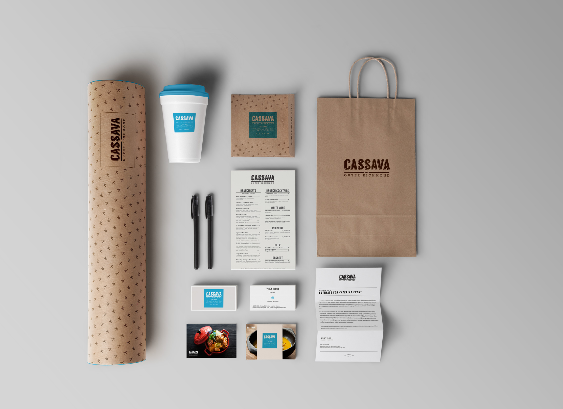
Fresh off a successful crowdfunding campaign launched and developed by Plinth, Cassava turned to Plinth to revise their branding to reflect the new Cassava concept. In 2012, Cassava opened as a small cafe and 1 year later evolved into a more serious restaurant. Here's how Plinth refreshed their look by focusing in on the essence of their concept.

Inspired by the great cafes of France,
Inspired by the great cafes of France,

Cassava always strived to bring the romance of Paris to their part of SF.
Cassava always strived to bring the romance of Paris to their part of SF.
2012
The original logo featured a sans-serif font, paired with a whimsical handwritten script font for the tagline separated by a thick rule.
SUMMER 2013
During the relaunch of Cassava, the owners chopped off the tagline to reflect the change from a bakery to a restaurant.
FALL 2013
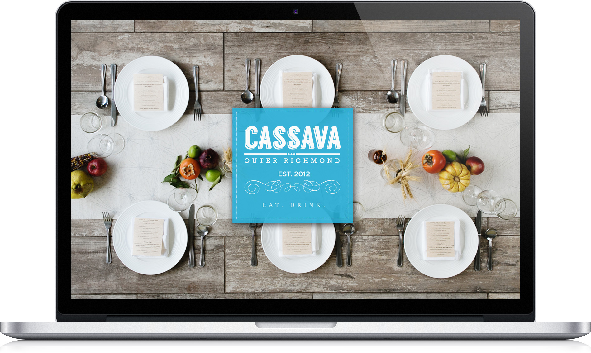
To bring an old world vibe to the logo, a the orginal sans-serif font was replaced with a raised block font that could be found in a window. Calling out their neighborhood in the tagline also reinforced neighborhood pride.

Web Presence
Web Presence


