


Turning an innovative product into a revolutionary brand.
Turning an innovative product into a revolutionary brand.
BACKGROUND
Before Drink is startup with a new product which promises to revolutionize the way a lot of people enjoy alcohol. When taken 30 minutes before drinking alcohol, Before Drink dramatically reduces the effects of Alcohol Flush Reaction (AFR) and allows it’s consumers to enjoy their night out without turning red. They turned to Plinth to create a compelling brand identity and build their web presence.
Understanding the consumer.
People who suffer from AFR turn bright red in the face and sometimes experience hot flashes with the slightest sip of alcohol. They are usually embarrassed by their condition and usually take measures like taking antacids or tailoring their make-up to offset the redness. Although AFR affects people of all races, slang terms like “Asian Glow” are commonly used to describe its effects since it is more pronounced in Asian ethnicities. People affected by AFR usually hide their remedies and prepare for a night of drinking discreetly.

The Competition.

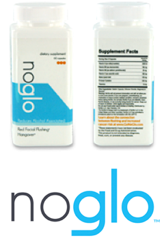

Competitors to Before Drink comprise of antacid medicine and other other pills made specifically to deal with Alcohol Flush Reaction. The competitors positioned themselves as advanced drugs with names like Alcotox which would cure people of Alcohol Flush Reaction. Other competitors had tag lines like “No Glo” or “No Red Face Formula”.
Their visual branding either had sterile, big pharmaceutical style graphics or a “as seen on TV” style with cheesy photos of women drinking martinis. The competition’s design looks like an experimental drug or a snake oil cure all. Plinth and Design Rehab worked to move Before Elixir far from that aesthetic.
Brand Positioning
Brand Positioning
Creating a unique position.
Plinth positioned Before Drink as a healthier, natural supplement which combats AFR’s effects. Since the company was tied to the term “Before”, Plinth & Design Rehab renamed the product an “Elixir” to highlight it’s more natural ingredients.
Positioning Before Elixir away from medicine and closer to a natural pre-party elixir serves to diffuse the perception of people affected by AFR as having a “sickness” or affliction to be cured.
“ Before Elixir isn’t a medicinal cure for your disease, it’s a simple, natural way to be your true self when you drink. ”
Rather than cure your condition, Before Elixir frees you from your constraints and prepares you for a night of endless possibilities.
Not just a tagline, an ANTHEM.
“Be Ready Not Red” is the anthem. It empowers consumers rather than ostracize them by using derogatory slang terms. This anthem serves to position Before Elixir as a casual part of getting ready for a night out. “Be Ready Not Red” is a strong statement that builds confidence and establishes Before Elixir as a product that prepares you to finally be yourself when you drink.
Designing for Before Elixir’s target consumer.
Designing for Before Elixir’s target consumer.
Before Elixir’s target consumer are hip, young professionals who enjoy going out multiple times during the week and sharing their experiences through social networks. Along with Design Rehab, Plinth drew inspiration from the holistic health movement, today’s fascination with asian pop culture and the craft cocktail movement to create it’s bottle design and website.
Design Rehab designed a clear bottle with a buddha type character which eventually turns clear after drinking the red elixir. Both the bottle and the website position Before Elixir as a fun, natural supplement they can be proud to drink as opposed to medicine to cure the their “sickness”.