


Branding Gourmet Cotton Candy
Turning a Seasonal Treat Into an Everyday Luxury
Branding Gourmet Cotton Candy
Turning a Seasonal Treat Into an Everyday Luxury
Sugar and spun (2015)
branding & WEB DESIGN
Background
Cotton candy inherently reminds of us childhood. It's a global treat traditionally enjoyed at carnivals, sporting events and fairs. Sugar And Spun is looking to change all of that.

Sugar And Spun creates artisanal cotton candy made with all natural ingredients with bolder, more adult flavors.
They are transforming cotton candy from a special occasion treat enjoyed by kids into an everyday luxury enjoyed by more sophisticated palates.
Sugar And Spun came to Plinth to evolve their brand and build a website that represented the shift in cotton candy they were creating.
They Made Flavors that Stood Out
But Their Branding Made Them Blend In
They Made Flavors that Stood Out
But Their Branding Made Them Blend In
The original logo
Sugar And Spun's current branding contained many elements common in cotton candy brands. It featured shades of pink and blue with up close photography of the product. Their logo was a cone with the "&" placed inside the cotton candy graphic.
Original Sugar And Spun Logo
At a quick glance, people thought the company name was "Sugar Spun" and the graphic was sometimes mistaken for an ice cream cone. When it wasn't mistaken for ice cream, the logo was easily lost amongst the myriad of cotton candy brands featuring the classic symbol.

The Cotton Candy Confectionary

Original Sugar and Spun

Tasty Tubs
Sugar And Spun was taking cotton candy into adventurous new directions with flavors like Pumpkin Cheesecake and Matcha Green Latté.
The new direction needed to be as bold as the company was, stand out on the shelves, and most of all, appeal to their core customer...women.
The new black
The new black
THE SOLUTION
Most cotton candy branding uses bright pastels off a white background but we wanted to go a different route.
“Since a large portion of Sugar And Spun’s clientele happen to be female, we wanted take what worked in cosmetics, which is bright pop colors off of black.”
Changing their base color to black gave the brand a more sophisticated feel. The black base color serves to help Sugar And Spun stand out on the shelves. Since Sugar And Spun is changing the way people view cotton candy, we chose black to change the way their brand was seen, to give the brand more edge, and reinforce the gourmet nature of their flavors.
A new logotype
We decided to do away with the cone logo and went with a logotype treatment instead. The iconic cone symbol would be used as more of an accessory rather than part of the company logo. The "&" symbol was dropped to help ease the confusion some customers may have when searching for the website or recognizing the brand on social media. The new logotype features a typeface that is a modern minimalist take off of some classic carnival fonts. Finally, we put the "AND" on a bias to imply movement.
All Natural Cotton Candy = Not Photogenic
Building an E-commerce Website that Communicates Fun, Bold Flavors that Look Like...Cotton.
All Natural Cotton Candy = Not Photogenic
Building an E-commerce Website that Communicates Fun, Bold Flavors that Look Like...Cotton.
To put it simply, all natural organic cotton candy isn't much to look at. Without artificial colors, the cotton candy loses the brightness of classic cotton candy. The gourmet flavored toppings don't help to make the product look more appealing or communicate the artisanal flavors that lie behind each bite.

Matcha Green Tea Latté Cotton Candy On It's Own

Matcha Green Tea Latté Ingredients Told as a Pattern
Our challenge was to create an e-commerce enabled website that can visually communicated Sugar And Spun's unique flavors while catered to their mostly female clientele. What was our solution?
“Since cotton candy with sprinkles looks deceivingly plain, we decided to use cotton candy as a prop to tell a story.”

Strawberry Shortcake

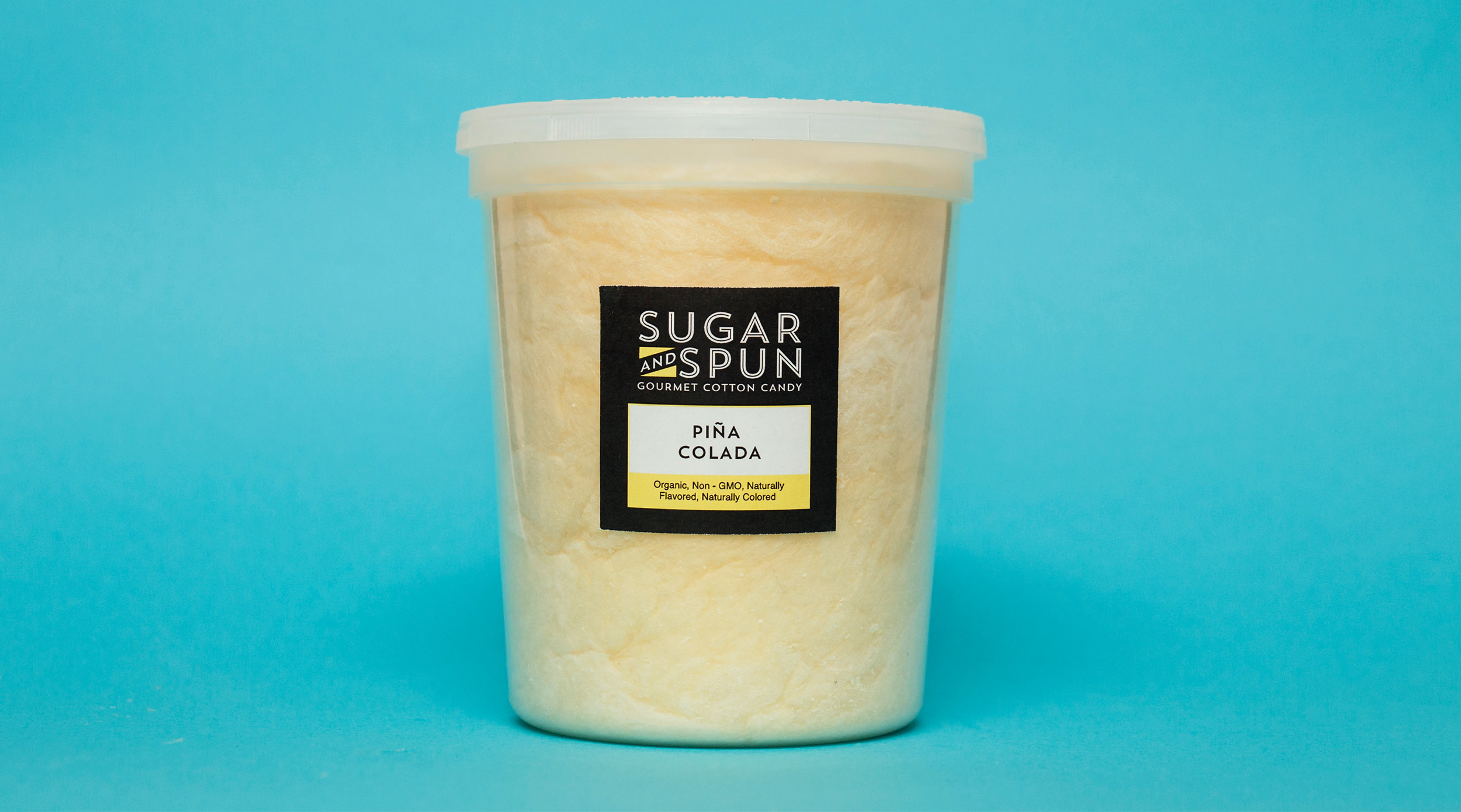
Pina Colada

Cookies and Cream

PB&J
We wanted to showcase the flavors visually rather than just listing off the ingredients. Since many of the Sugar And Spun's female clientele were into DIY / ETSY culture, we decide to go with a paper craft look and add a Wes Anderson-ish spin to give the website some quirkiness and fun. We used a mix of props and real ingredients to create a visual language with patterns to describe their unique flavors.
Using props to tell a story
Using props to tell a story
Bringing the elements together
We continued the paper craft theme throughout each section by creating whimsical scenes using props and cotton candy. The new black color base allows the colors and scenes to really pop.


After its launch, the new website is performing above the industry standard for e-commerce. Typical conversion rates hover around 1-2% where the new SugarAndSpun.com is currently at a 5% conversion rate.
“Sales from our new website alone are on track to easily pay someone a modest salary for a year”