


Refreshing a brand with a successful 15 year history
Refreshing a brand with a successful 15 year history
OZUMO (2016)
branding & WEB DESIGN
Background
Ozumo has been an institution in San Francisco's culinary scene for 15 years, which is an eternity in todays ultra competitive restaurant business. Ozumo has grown to include a location in Oakland and other concepts in Southern California. Needless to say they were growing, and growing fast.
Ozumo came to Plinth because they wanted to give their website a new look and feel. After consulting with Ozumo, we realized that a growing company like this needed more than a new look, they needed to establish who they were as a brand.

Objectives
Objectives
Uncover
Discover the Ozumo's heart and soul in order to build a firm foundation for their rapidly growing brand.
REINVIGORATE
Update Ozumo's design language reflect the new brand while paying homage to Ozumo's rich history.
CREATE A NEW WEBSITE
Elevate the online experience to match the customer's real life experience.
DICOVERING ozumo's HEART AND soul
and building a brand around it.
DICOVERING ozumo's HEART AND soul
and building a brand around it.
digging deep
Many business can be successful without building complete a brand but Ozumo had plans to grow and needed to tell the world what they stood for. Although many owners have an instinctual feel as to what their core values are, defining them in a concrete way helps to create a brand's north star.
The brand's north star helps gives the company purpose, makes it easier to make business decisions, and helps to define how you're different from the competition.
After speaking with Ozumo and going through some brand exploration exercises we, established their core values.

After gaining more insight into what Ozumo's core values were and what they was offering customers, we came to the conclusion that Ozumo was much more than what their tagline and design was communicating, which was "Contemporary Japanese Cuisine".
Strategy FuelS design
Strategy FuelS design
A NEW DIRECTION
With the Ozumo's core values firmly established, we began to move Ozumo's branding towards a place that offered more than just "Contemporary Japanese Cuisine". Ozumo offers robata, sushi, specialty items, and a sake lounge where people can gather and enjoy. We started by creating a new tagline for Ozumo which proclaimed exactly what they embodied.
"REFINED JAPANESE REVELRY"
Refreshing the Logo
The challenge with re-refreshing a logo of a successful company is creating a new design that still contained elements of the company's history while simultaneously moving the brand forward.
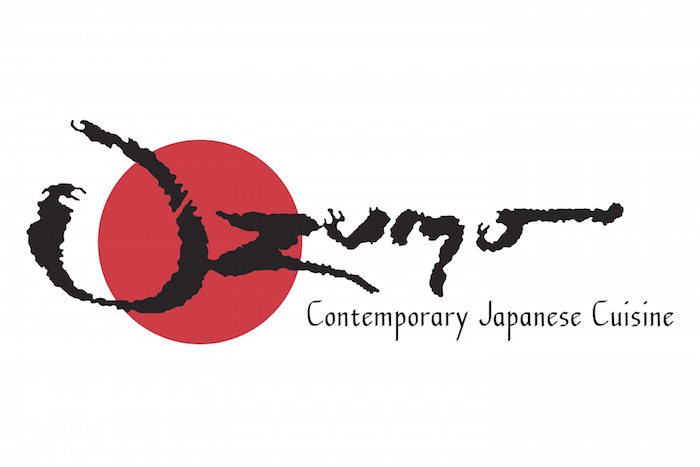
Original Logo
The original logo used a brush script and a classic red Japanese sun, all elements very common in the branding of Japanese cuisine.
Bringing a sense of heritage into the future


To bring a sense of heritage to Ozumo's new logo we took inspiration from the traditional Japanese family crest called a "Mon". The signature colors were changed to a deeper red and gold to emphasize luxury.

We based Ozumo's new mark on a modern interpretation of the Mon along with the "Oz" form incorporating the company's rich history. We did away with the brush script in favor of more modern font to communicate "Refined Japanese Revelry". The new mark was kept simple to allow it to be used in other applications like stamps and their 15 yr anniversary graphic.


Changing the mood
Changing the mood
Designing a website to communicate the new brand

The old website showed close up food photography on a sterile white background. Each page featured several navigation points making it thorough but busy. The layout of the original website was a little difficult to navigate on mobile and failed to communicate the indulgent times awaiting inside each Ozumo.
The new website and design layout was optimized to how most people today are viewing web content, on mobile.
Welcome to the Darkside
We chose to use black as Ozumo's new background color to make food images more dramatic and convey give the brand a more luxurious feel. Dark photography was used to tell narrative that emphasized Ozumo's main competitive advantage, complete experience.
The photography shot by the Werehaus was used to to put equal focus on the all components of the Ozumo experience: ambience, indulgence, craft, and revelry.

EVERYBODY LOVES VIDEO
Shareable content is key and video is the king of engagement all of the social media platforms. To celebrate Ozumo's 15 Year Anniversary and new brand, we went back to the Werehaus to create a video that can easily be cut into bite size pieces for use on Ozumo's social media.

New Ozumo Video by the Werehaus
Working with Ozumo for their brand refresh was great and we're continuing to work with them to brand their upcoming projects to stay tuned.