


Re-branding a company that's poised for growth
Re-branding a company that's poised for growth
fk frozen Custard (2015)
branding & WEB DESIGN
Background
FK Frozen Custard (formerly Frozen Kuhsterd) started in 2011 as a stand at the Underground Market in San Francisco. In 2012, they became California's first frozen custard food truck and one of the highest rated on Yelp. Their company was growing and they needed a new brand that would grow with them.

FK's original brand direction was trying to appeal to the kid in everyone, and had a very young, child like brand experience.
As they began to grow they learned that their propensity to push the flavor envelope and desire to mashup more “adult” flavors drew a more grown up and worldly palette.
FK came to Plinth to provide design solutions to address the who their customers really were.
What's In A Name
What's In A Name
FK Frozen Custard's original name was FROZEN KUHSTERD. The name was born out of wanting to be original by spelling custard as it is phonetically and being direct about what they sold. While this worked in the infancy stages, it made it hard expand. FK found that they were constantly explaining exactly what their product was. At festivals they’d have their original sign of FROZEN KUHSTERD with a sign above that said FROZEN CUSTARD.

The company name being the same as their product left little room to differentiate themselves in the frozen dessert scene.
After a few brainstorming sessions, we settled on FK FROZEN CUSTARD. The moniker "FK" pledged homage to the roots of their company, but also gave it a handle. This allowed the FK brand the flexibility to extend into other dessert categories.
About face
About face
Kevin was the original mascot of FK. The owners had a sentimental attachment to Kevin and wanted to keep their beloved mascot. This was a challenge because it made the brand feel young and dated and failed to communicate the radical and inventive desserts they were serving. They needed a design solution that retained Kevin's childlike openness but left room to grow.


“To solve this I made the first iterations of Kevin a flat silhouette with the new FK cursive type cut out. This allowed for more uses of Kevin as a stamp, sticker, and overall easier to use design element for the brand.”
A voice that resonates
A voice that resonates
An important part of building a brand is establishing a voice that represents the company. It is this voice that helps to guide how you say things and equally important, how NOT to say things.
“Kevin is the mischievous but well intentioned life of the party. He is the voice in your head tempting you to let go of your inhibitions and live life to the fullest.”
The voice of the new Kevin had to be established and it had convey how FK's desserts and their brand stand out from the rest all while staying true to the soul of the company. The new voice we developed is cheeky, fun, curious, and daring, but is NEVER mean, judgmental or cynical.
We created a host of sayings like: "Cheat Day Everyday", "Don't Flavor Hate, Innovate", "Churning Frowns Upside Down", and "Chillionaire".


Modernizing americana
Modernizing americana
Frozen custard’s roots are in the Midwest. We needed a way to touch on this, but also let both existing and new customers in the Bay Area know that this was indeed the classic American treat they might have experienced back home, but flipped on its head and mashed up with West Coast flavor combinations.
We settled on a cream (custard color), muted blue and vibrant red accent. What says America better than RED, WHITE, & BLUE! The blue with red & cream accents has become their branded experience, and can now be spotted amongst the sea trucks they are parked near at food truck meet-ups.
FK loved the trend of using text as pattern, so we created a text pattern using words that differentiate frozen custard from ice cream. We used words that represented the new FK brand voice like DECADENT, RICH, YOLK’D OUT, NAMATASTY & CHURNT UP.
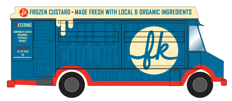
By mashing up classic Americana with the vernacular used by Bay Area millennials (their core customer base), we created something new that still paid homage to its roots.
A Dynamic Online Experience
A Dynamic Online Experience
After establishing FK's new brand identity, we created a new website that was optimized for mobile users and continued their new brand experience. The new site featured a looping video of people enjoying FK's desserts as well as the team hand making new flavors.

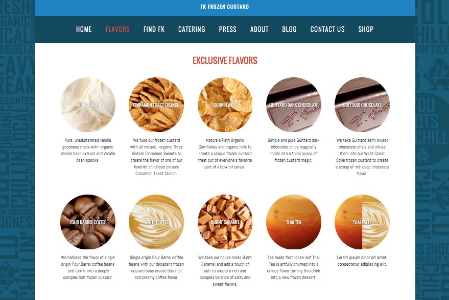
We incorporated a catalog of all the flavors FK had created in the past complete with tons of pictures to bring focus to their dedication to innovative flavor profiles.
And in the end
And in the end
“Thanks to Plinth we finally have a brand that represents the best of who we were, who we are now, and who we’re growing to be. Most of all, we now have a brand our customers love as much as we do.”